Light Gray Subway Tiles
I have recently been in the midst of picking out subway tiles for numerous projects. For some projects we have opted for white tiles in larger sizes (staying away from the over use of white 3×6 subway tiles, which I will write about soon, and, for others I have picked Light Gray Subway Tiles. Now, why gray? Because it’s a trending color? Because it’s not white? Because gray is cool?
Well, gray is a cool color I will admit, besides blue it is my favorite color, but it definitely isn’t a recent trend. Many think it is a “trend” that is new to the interior world and will fade out. Oh no my friends, it is a color that has been used in interiors for centuries and FINALLY people are accepting it as a neutral color, like white and beige. Centuries ago and through the years it has always been used as a neutral in the design world.
You see, the above is of St. Georges Hall in the Palace of Catherine II (Russia) in the late 1700’s. Okay, check this one out.
Philip Hussey, ca 1750
Do you see it? Gray walls (these are painted walls) but imagine wallpaper which is super trendy right now. Yes! the splash of a red Persian rug, also super trendy right now. The chairs, yup those too I see in homes, painted gray or white or kept mahogany, and last but not least, gray walls, and even a gray suit!
Okay, so you get my point. Not yet? Well here is Johann Georg Platzer Baroque painting from the 1730’s depicting a dancing scene in a royal palace with those gray washed walls and color form.
One more.
Joseph Van Aken (Philedelphia Museum) circa 1709-1749
Light Gray Subway Tiles
I mean we could probably name these wall colors today, Stone by Benjamin Moore in the Van Aken Piece, Stonington Grey by Benjamin Moore in the Winter Palace piece and so no and so on.
Now, you ask, Why gray subway tiles? Is grey possibly trending out?
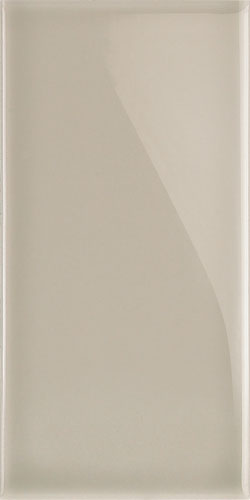
Gray is NOT leaving any time soon. It has become an accepted neutral by the masses, finally. Also, for me, personally, when you have a home with a lot of white, for instance, white slipcover sofas, white lamps, white chairs, white trims, white walls, I wanted to offset this with a punch of color. That color being gray. I wanted a strong masculine definite gray to stand out and make a statement amongst all the white. At the same time, respecting the era of the home, 1920’s, I wanted a gray that did NOT feel too modern. I needed it to feel aged. After, searching and searching, I found the perfect tile.
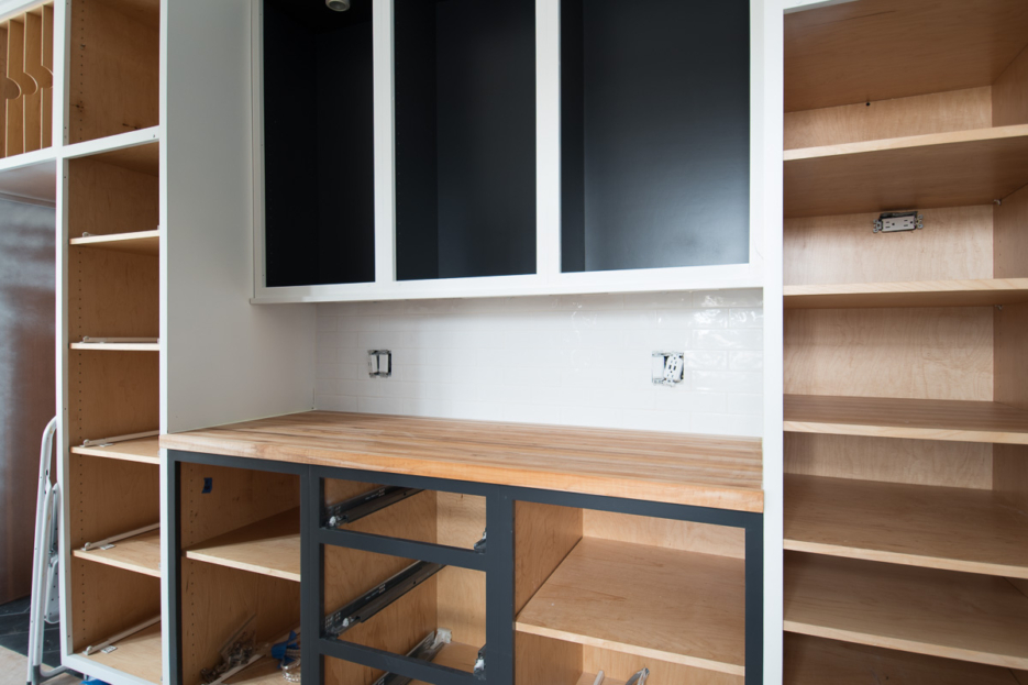
What makes it perfect is that the grey hue does not feel too modern. It has a slight beveled off colored (“aged”) edge. I also love that in some light it might give off slight hues of a pumice color scheme, from grey to white to beige. Here is another shot from a different light and angle. Don’t worry, stay tune to see how it all turns out.


